Behind the Scenes of a Successful Video Shoot: 15 Steps to Perfection Introduction to the…
The Psychology Behind Colour Grading in Movies and TV Shows: 15 Key Insights
Introduction
Ever wondered why some movies leave you feeling nostalgic while others have you on the edge of your seat? The answer often lies in the subtle yet powerful art of colour grading. This intricate process shapes how we perceive emotions, characters, and even entire stories. From the golden warmth of sunsets to the chilling blues of winter, colour grading is the silent storyteller behind the scenes.
What is Colour Grading?
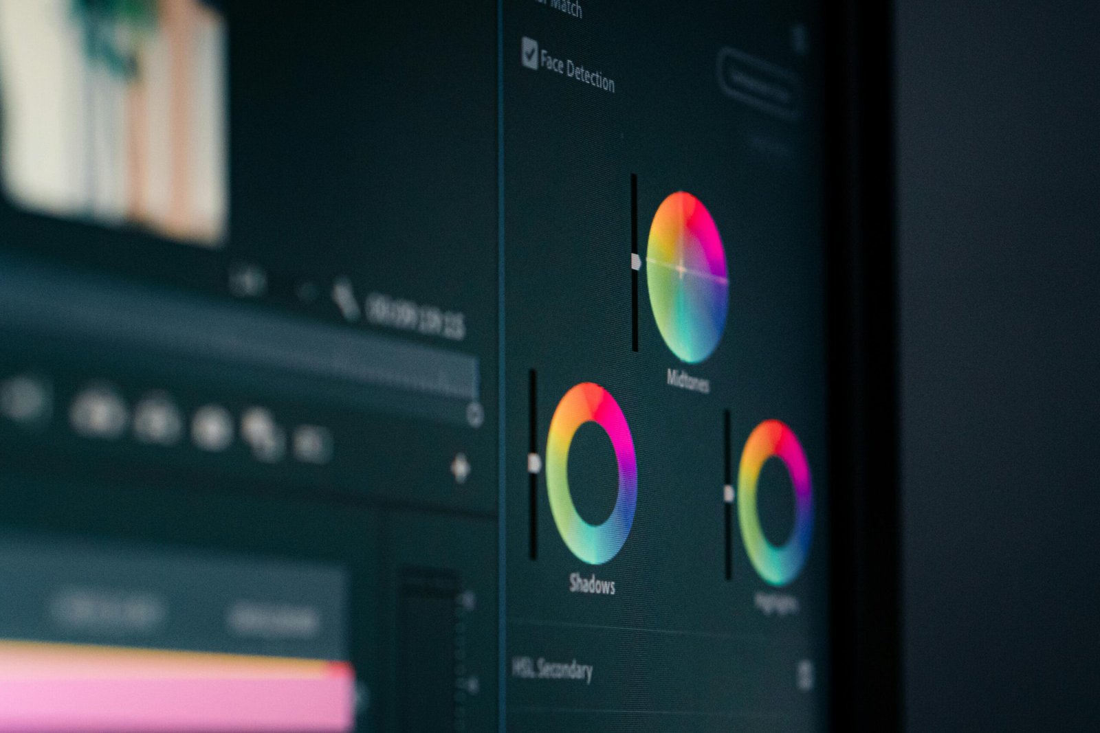
At its core, colour grading is the process of enhancing and altering the colors in a film or TV show to achieve a specific mood or visual style. While color correction ensures that footage appears natural and consistent, colour grading goes a step further, injecting emotion and depth into every frame.
The Role of Colour in Visual Storytelling
Colors are more than just aesthetic choices—they’re psychological triggers. A splash of red can evoke passion or danger, while a soft pastel might feel serene. Directors and cinematographers carefully use these hues to set the tone, guide attention, and evoke emotional responses.
Historical Evolution of Colour Grading
In the early days of cinema, films were black-and-white, relying on lighting and composition for mood. The introduction of Technicolor brought vibrant palettes, revolutionizing storytelling. Today, digital tools have made color grading more versatile and precise, offering limitless creative possibilities.
The Science of Colour Perception
Why do certain colors make us feel a certain way? It’s all about how our brains process wavelengths of light. For example, blue tones can lower our heart rate, making us feel calm, while reds can have the opposite effect, energizing or alarming us.
Popular Colour Grading Techniques
Filmmakers use specific grading techniques to align visuals with narrative themes. Warm tones, with their yellows and oranges, often invoke nostalgia and comfort, while cool tones like blues and grays heighten tension and unease.
Examples of Effective Colour Grading in Movies

- The Grand Budapest Hotel: Its pastel palette gives it a whimsical, almost dreamlike quality.
- Mad Max: Fury Road: The stark contrasts between fiery oranges and steely blues create an apocalyptic intensity.
Colour Grading in TV Shows
- Breaking Bad: The series’ greenish-yellow tint subtly reflects the moral decay of its protagonist.
- Stranger Things: Vibrant neons immerse viewers in 1980s nostalgia while hinting at the otherworldly.
Using Colour to Define Characters
Assigning specific colors to characters can subtly influence how audiences perceive them. For instance, in The Dark Knight, Joker’s green and purple costume underscores his chaotic and eccentric personality.
Colour Grading and Genre
Different genres demand distinct palettes. Horror films often use desaturated tones to evoke dread, while romances lean on soft, warm hues to enhance intimacy. These choices aren’t just aesthetic—they’re psychological.
Tools and Technology Behind Colour Grading

Software like Adobe Premiere Pro, DaVinci Resolve, and Final Cut Pro are industry staples. With AI integration, color grading is becoming faster and more precise, allowing creators to push boundaries.
Challenges in Colour Grading
Achieving the perfect look isn’t without its hurdles. Graders must balance artistic vision with technical limitations, ensuring consistency across varying lighting conditions and scenes.
The Business Impact of Colour Grading
A well-graded film or show isn’t just visually appealing—it’s marketable. A consistent, striking palette can make a production more memorable, increasing its appeal to audiences and advertisers alike.
The Future of Colour Grading
With advancements in augmented and virtual reality, the future of color grading promises more immersive storytelling. Filmmakers are also exploring sustainable practices, minimizing environmental impact without compromising on creativity.
Conclusion
Colour grading is far more than a post-production process—it’s a vital storytelling tool that shapes how audiences feel and connect with a narrative. Its ability to evoke emotions, define characters, and even dictate genres makes it an indispensable part of modern filmmaking.
FAQs
- Why is color grading so important in filmmaking?
It enhances storytelling by evoking emotions, defining moods, and aligning visuals with the narrative theme. - How does color grading affect viewer emotions?
Colors trigger psychological responses, like red evoking urgency or blue calming the viewer. - Can color grading change a film’s genre perception?
Absolutely! For example, warm tones can make a thriller feel like a drama, and vice versa. - What’s the difference between color grading and color correction?
Color correction ensures footage looks natural; color grading focuses on creating a specific mood or style. - Are there any limitations to color grading?
Budget, time, and technical constraints can pose challenges, but skilled professionals can work around these issues.


